See it all come together
Branding is not a static point or given moment in time. It isn’t superficial or contrived. Branding is a state-of-being. It’s discovering who we are. Understanding why we’re here. Realizing who we can become. And believing we’re the best.
Branding is a reflection of our very essence. Within it lies life itself.
The Following cases demonstrate how some clients acquired the vision. As well as reaped the rewards!
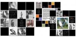
Gloria Tew – Web/Direct Campaign
The overarching objectives of this print/digital tandem are twofold. Reaching out, connect with, and, inviting visitors into the life of this incredibly talented artist, and, truly amazing person. And bringing Gloria’s exceptional gifts and talent out, sharing them with the world.
A truly inspirational site, for an even more incredible woman, can only lead to one thing. Success!
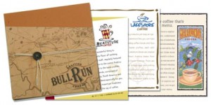
Bull Run – Identity Development
This multifaceted campaign (Positioning, Name, Logo, Collateral, Website, and, more, helps Bull Run introduce and educate key prospects. Converting them to invaluable clients upon their understanding the “real” value of relationships.
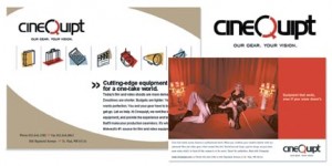
Cinequipt – Repositioning
Cinequipt requested an enhanced identity, better reflecting their standing as an industry leader. A Positioning Analysis, Brand Strategy, and, subsequent tactical (communication) recommendations, and, execution, presented a much more complete picture and compelling story. Tactics included a refreshed logo, positioning line, print sales piece, ad campaign, product catalog, direct cards, and, a comprehensive web site.
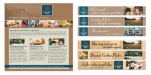
Carlson Lifestyle Living – Online Campaign
Carlson Lifestyle Living, a provider of custom luxury homes and a community setting in the San Antonio area, wanted to test the effectiveness of a website and direct email campaign – as marketing tools to build leads and inspire “real-world” site visits. We planned, designed and managed a banner ad campaign that ran on a group of targeted web sites, based on audience profiles. Our email campaign targeting specific, potentially invaluable audience members, generated sky high click-through rates, and increased conversion rates by 200% domestically, 400% internationally. Additionally, seven times as many information requests, and, “real world” site visits occurred than did prior the campaign.
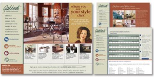
Gabberts – Providing Perspective
Gabberts, a leading home furnishings retailer, asked us to help modify customer perceptions, driving both website and store traffic as a result. As part of our extensive web site redesign, we created a section helping customers identify their “style.” And, locate furniture and accessories to match the look. Ultimately leading to sales. We created and incorporated additional information and interactive tools (such as online registration for store events) as well, shining valuable light on Gabberts many services and offers helping customers reinvigorate their living spaces.
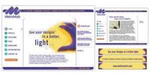
Eagle – Unified Direction
Eagle wanted their sales staff to be on the same page in communicating a unified, inspiring message. The web site (inc. a Flash intro highlighting services and capabilities) branded, completely customizable, in-person sales presentation, and interactive, downloadable e-brochure, took business to new heights.
